Past Work
Here is some of my past work. Please contact me for additional samples.
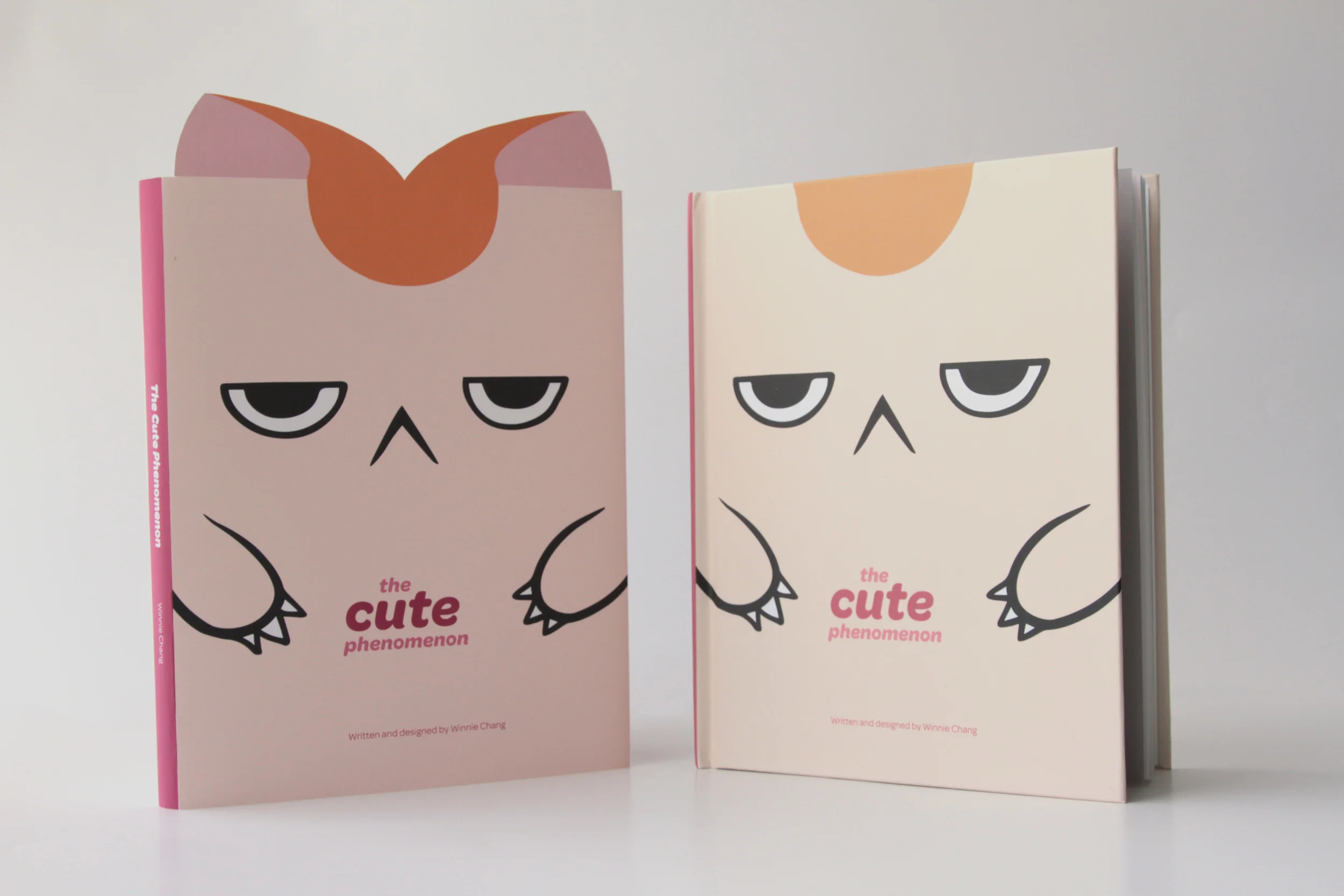
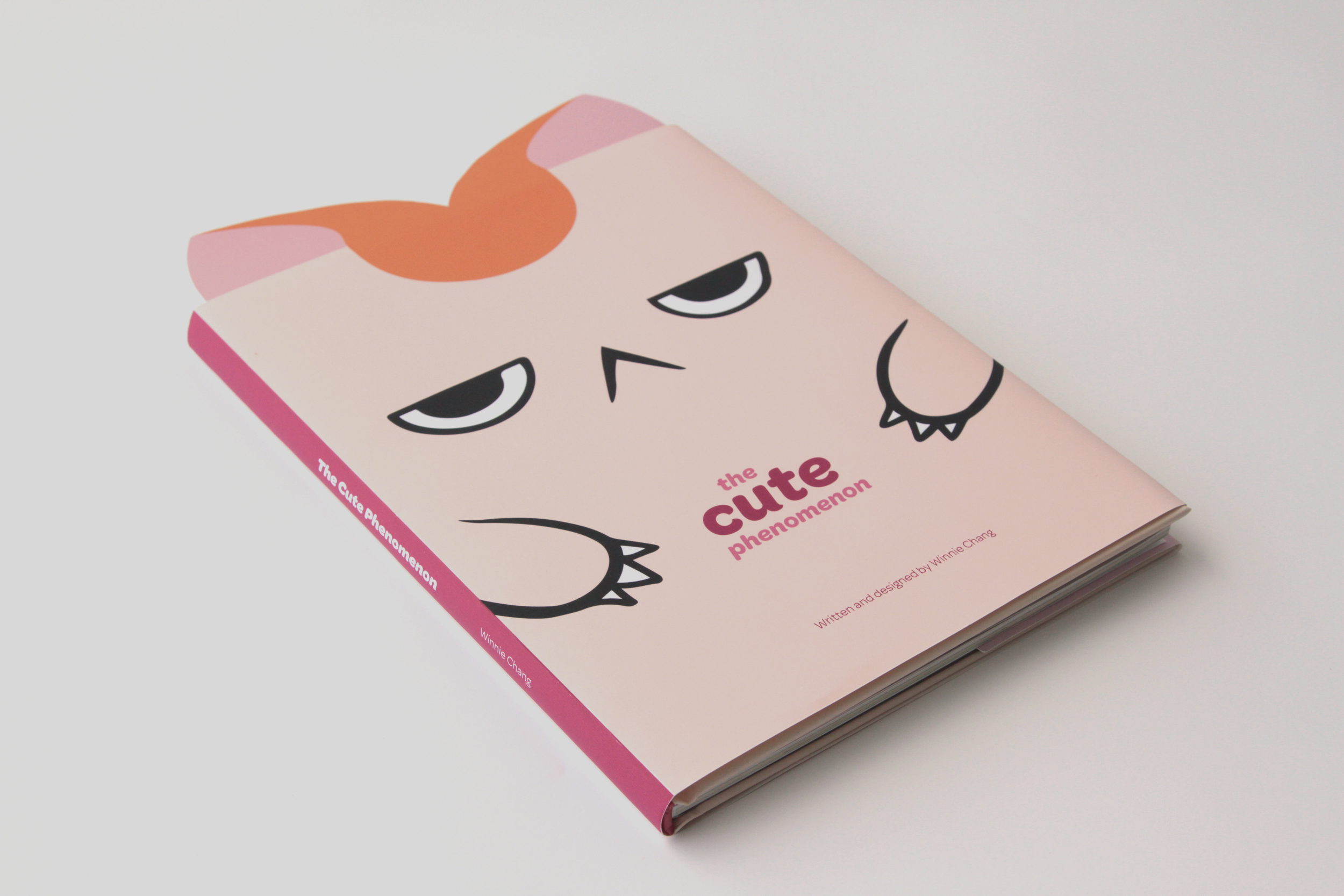
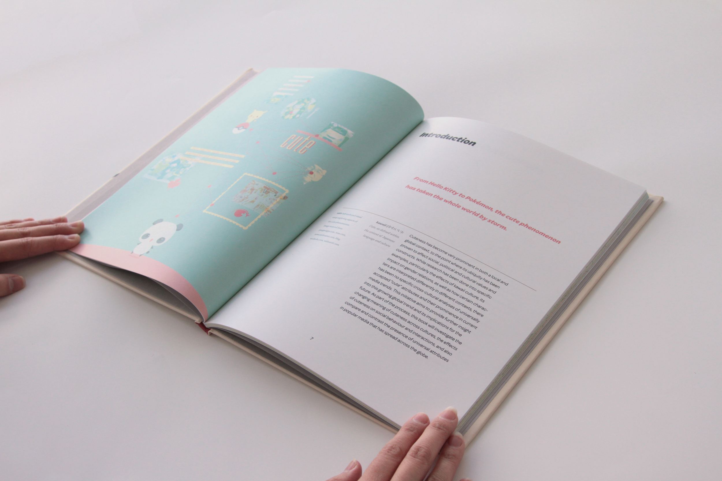
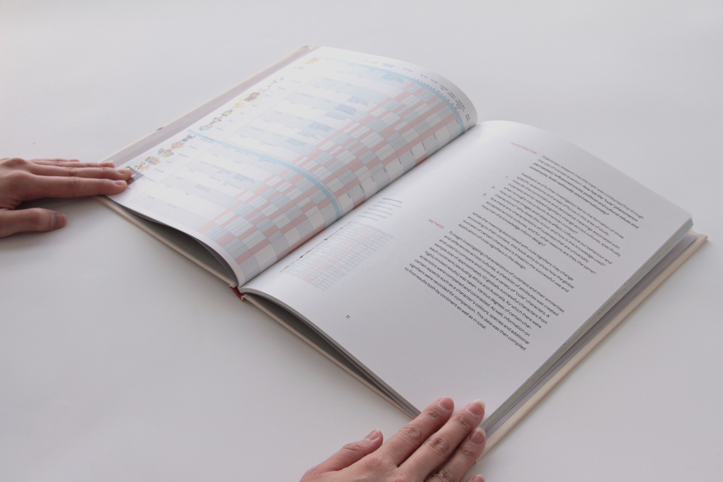
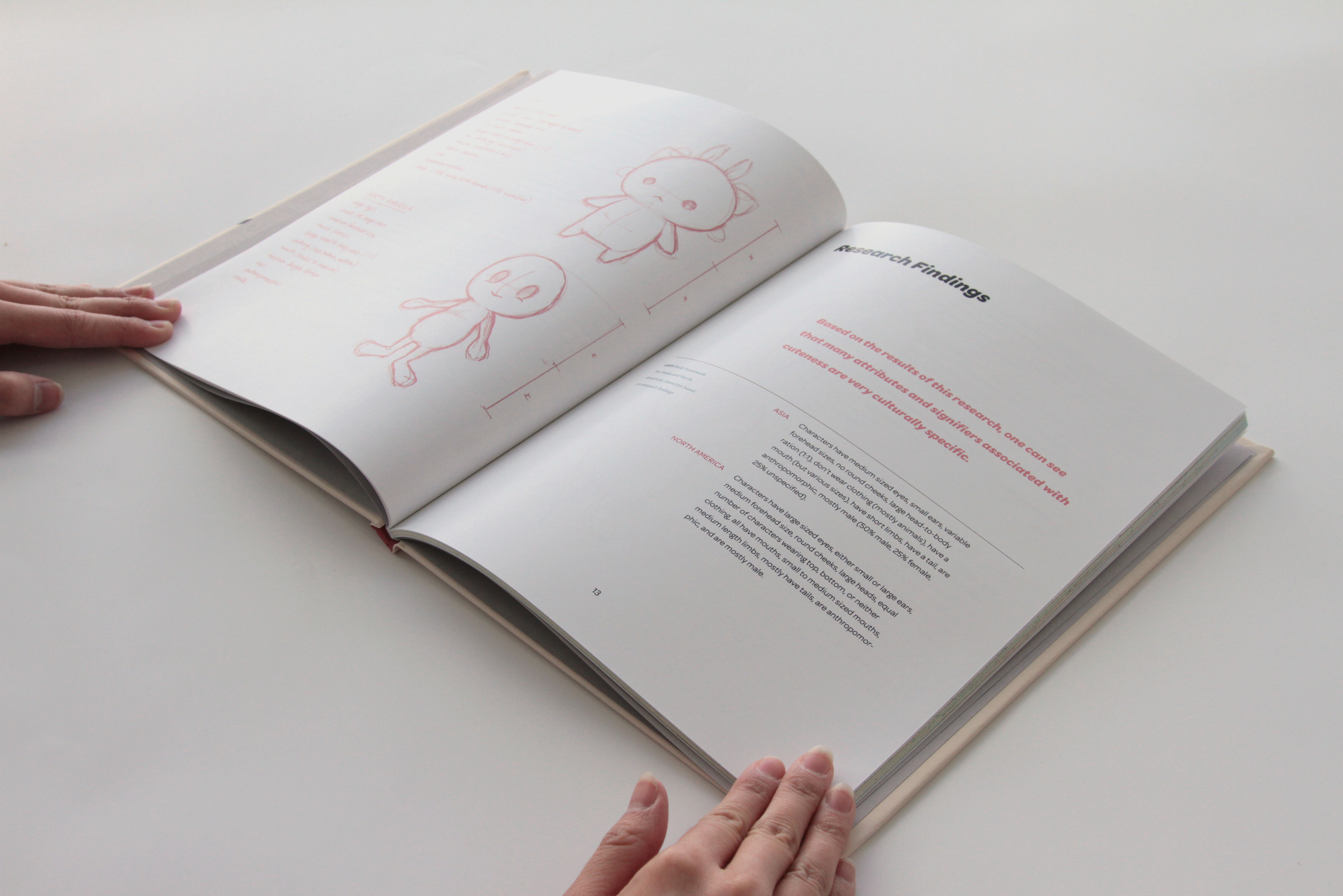

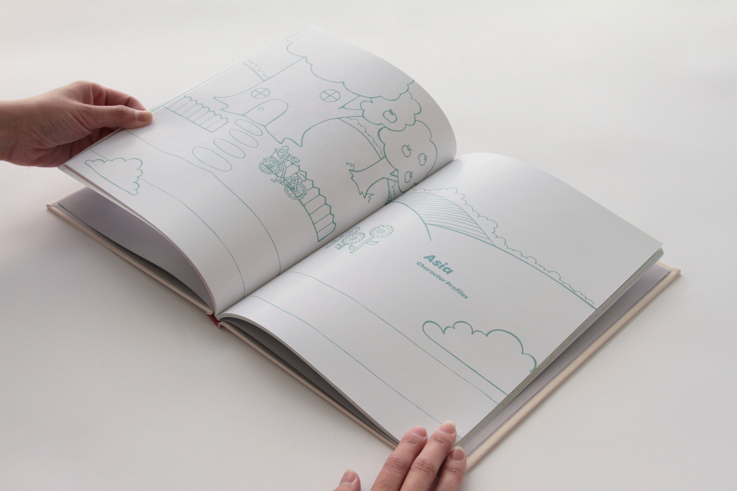
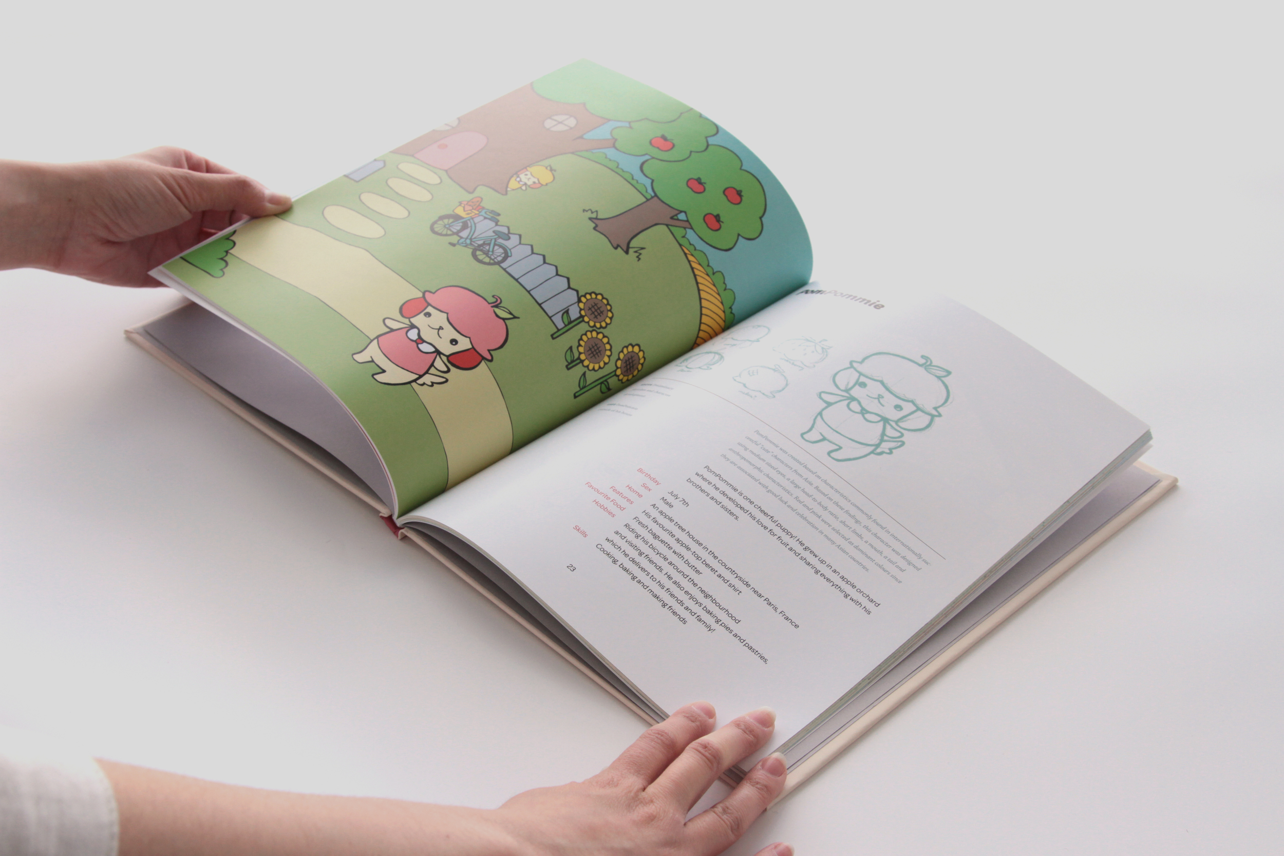


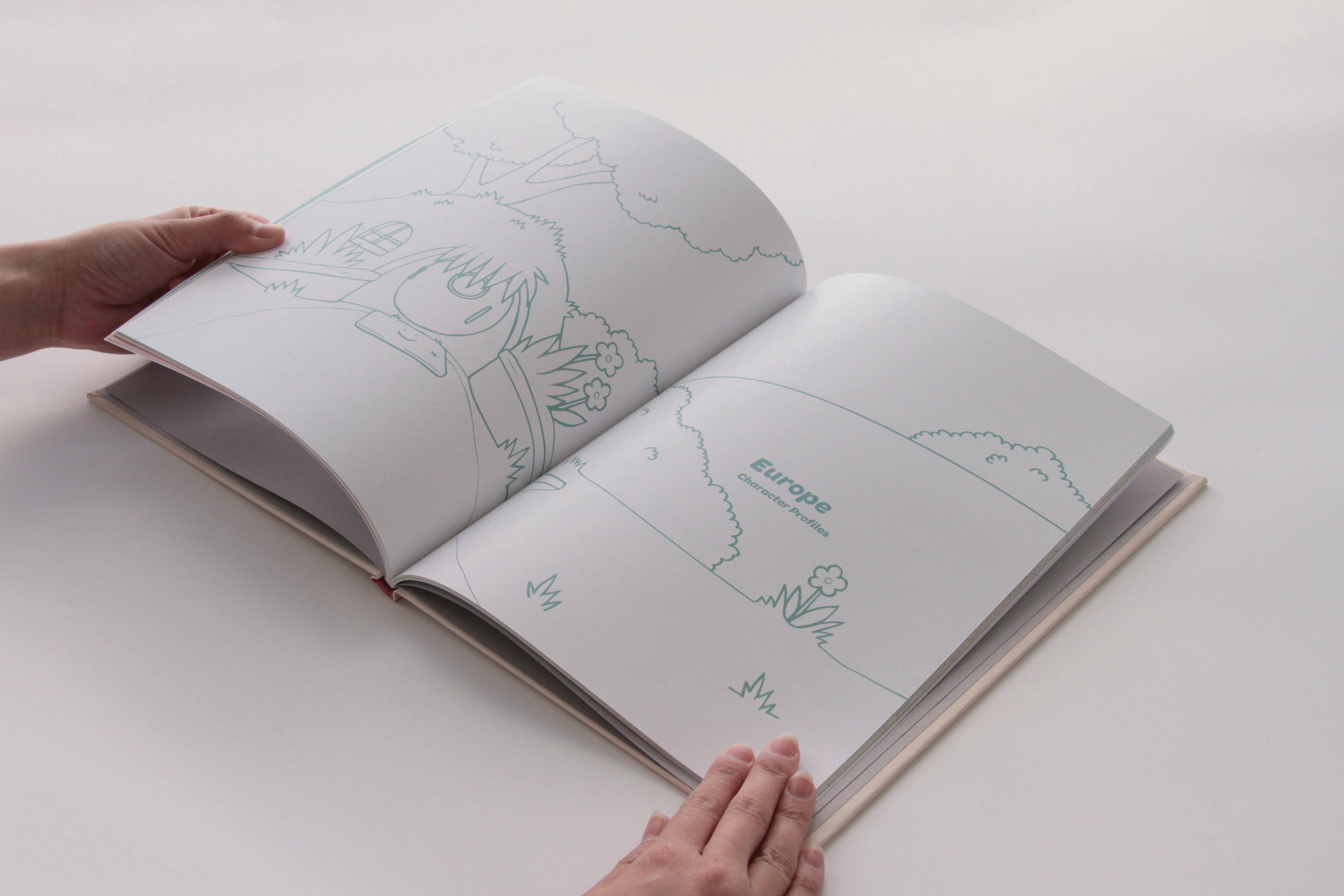
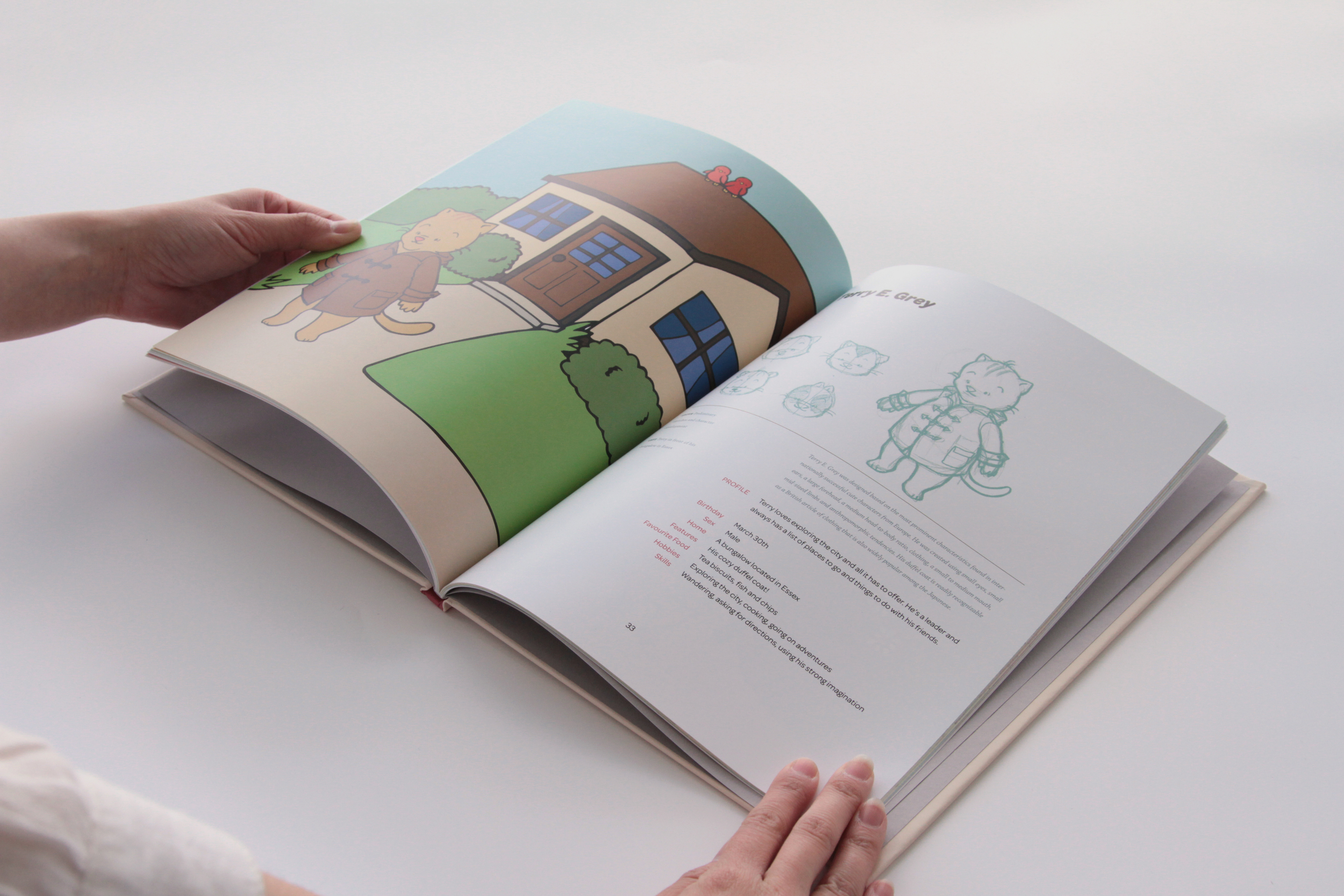
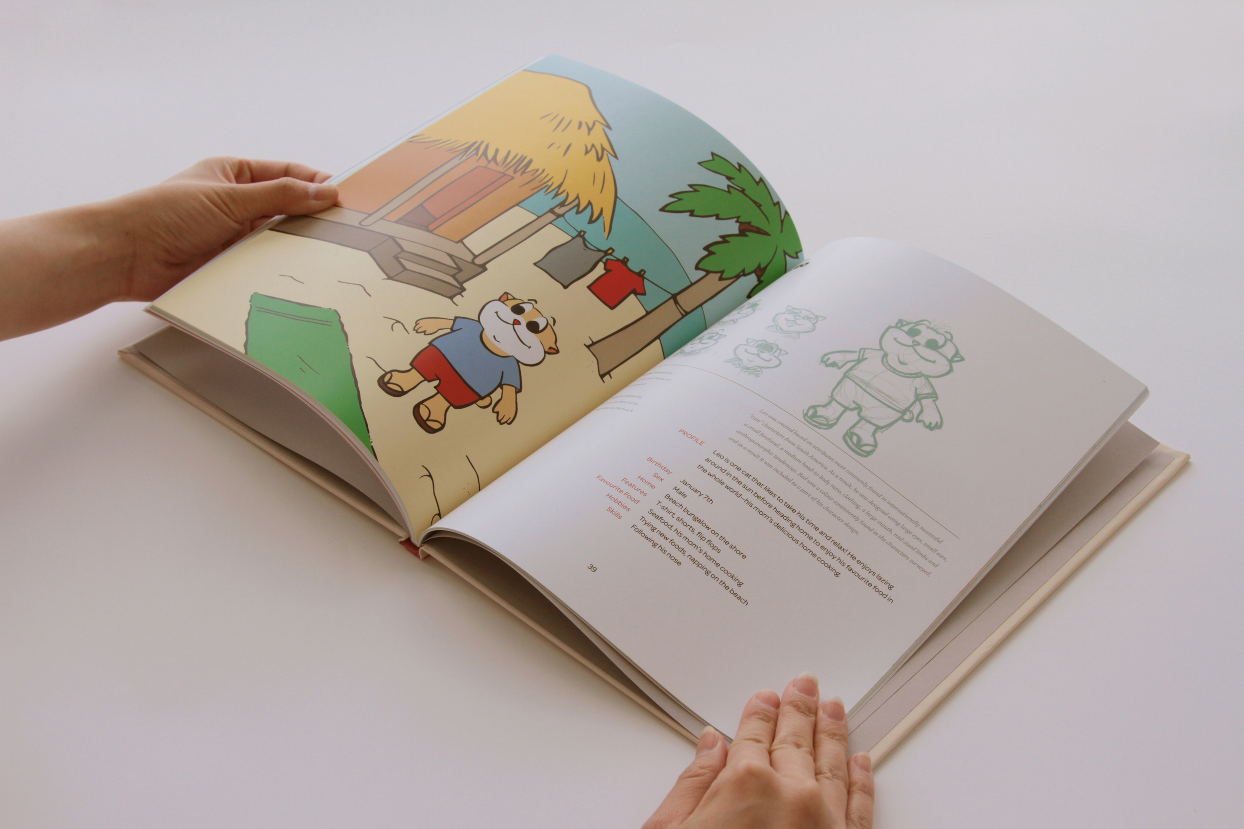

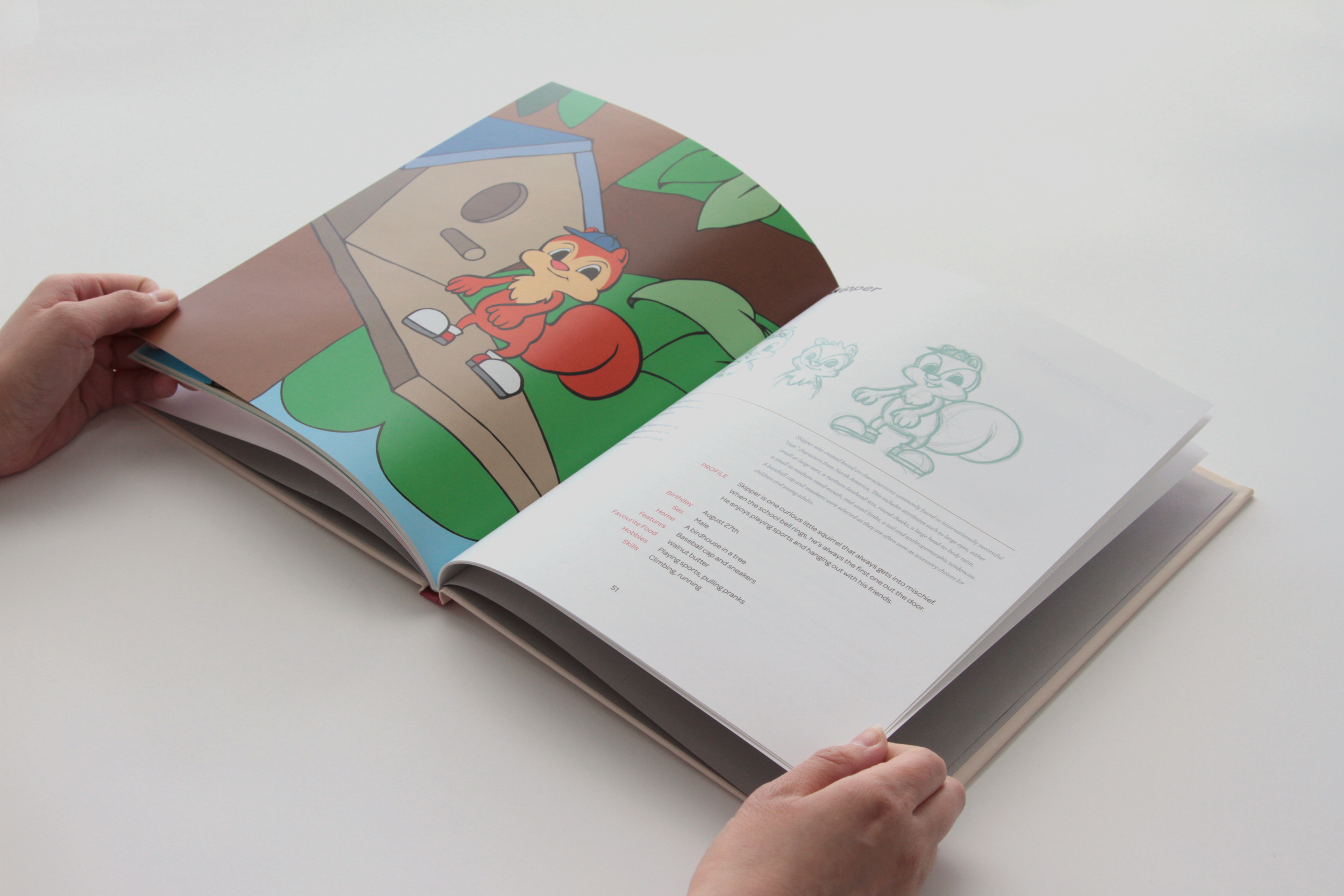
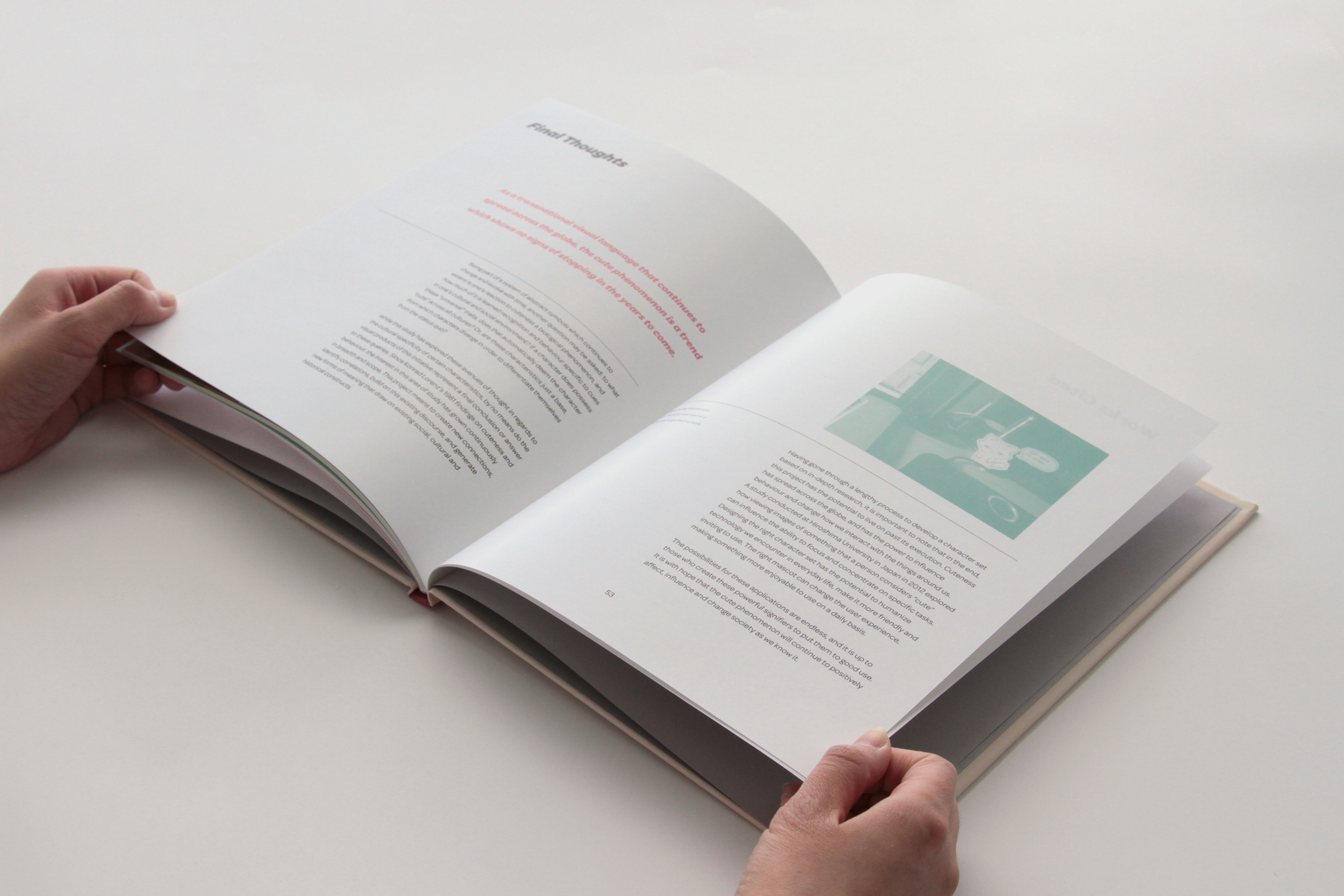
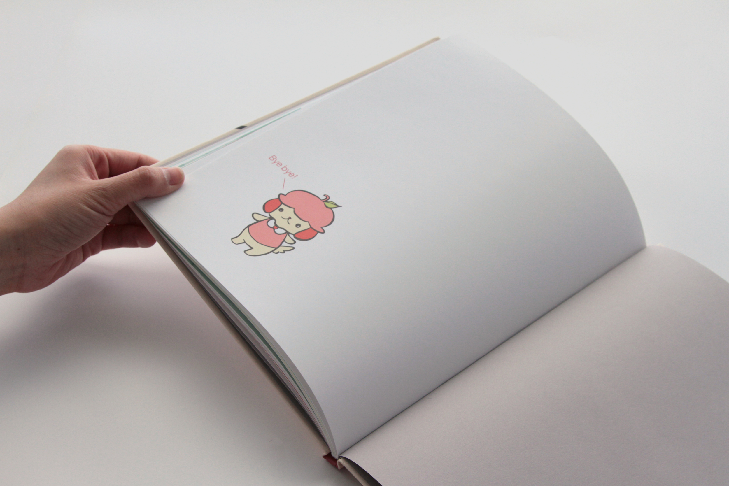
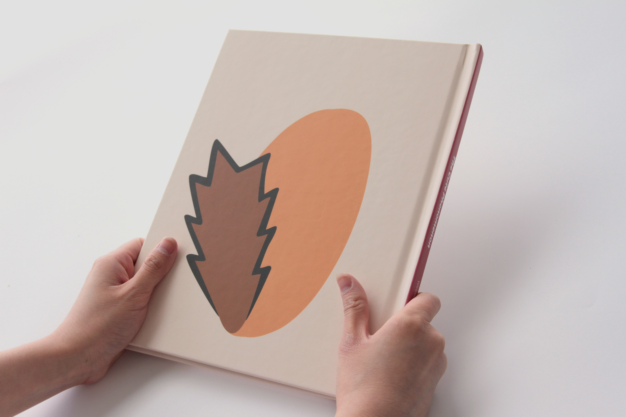
The Cute Phenomenon
This book investigates the changing meaning of cuteness across cultures, the effects of cuteness on social behaviour and interactions, and also compares and contrasts the presence of universal attributes in popular media that has spread across the globe. Reinforcing the idea that cuteness is culturally specific, it culminates in the introduction of 12 characters developed as a result of this visual analysis of cuteness as an effective visual language.
Adobe Design Achievement Awards 2013 Semifinalist
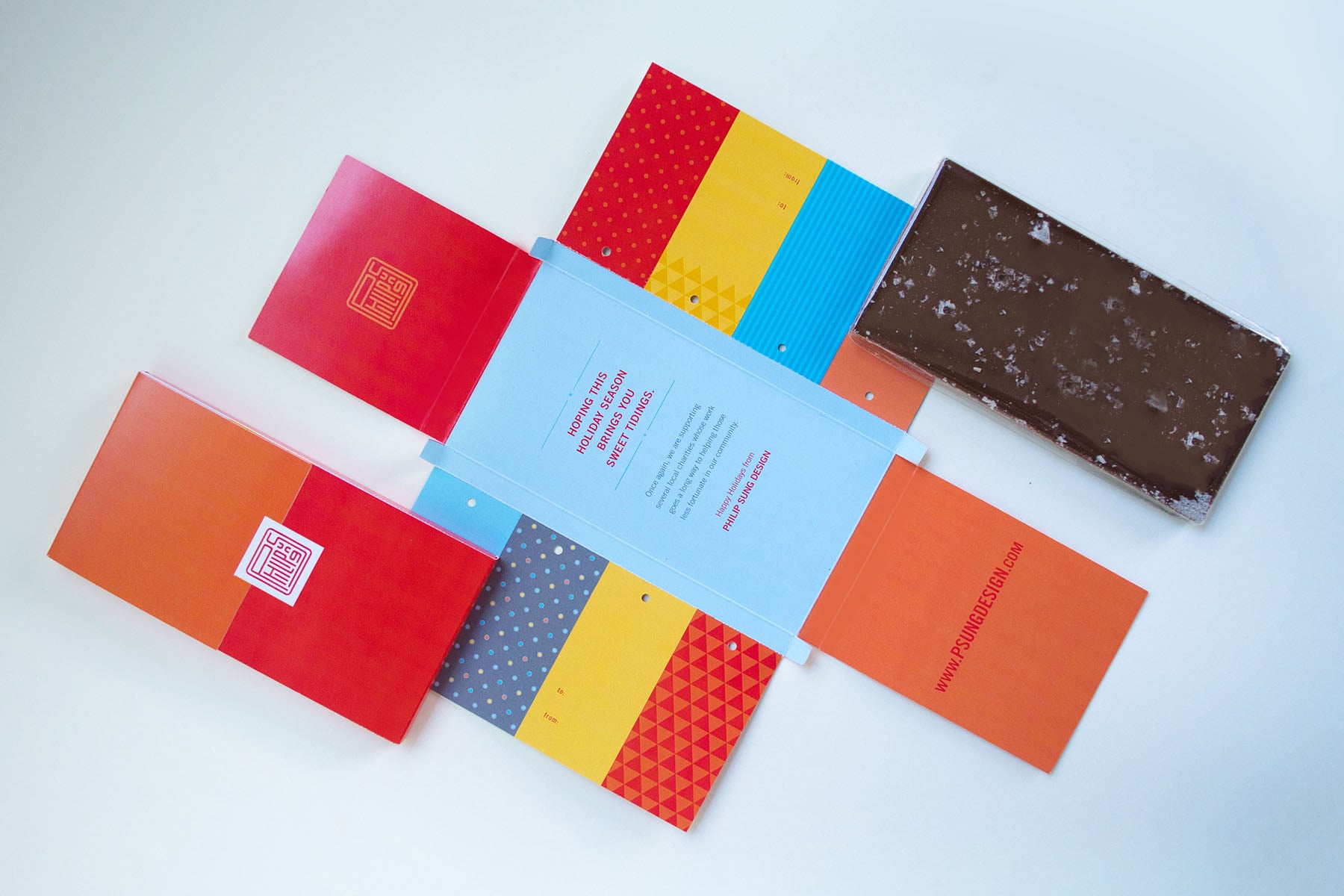


Philip Sung Design Holiday Promo
The purpose of this package is to thank Philip Sung Design’s new and existing clients for their patronage, inform them of our charitable donations and promote the launch of the studio’s fresh, vibrant new website and approach. To continue the cycle of positive relations and thoughtful gift giving, tear-off gift tags suitable for all occasions are incorporated into the design, giving additional value and a second use to the package after the chocolate has been consumed. Art direction by Mary-Anne Bédard and copywriting by Bill Ford.
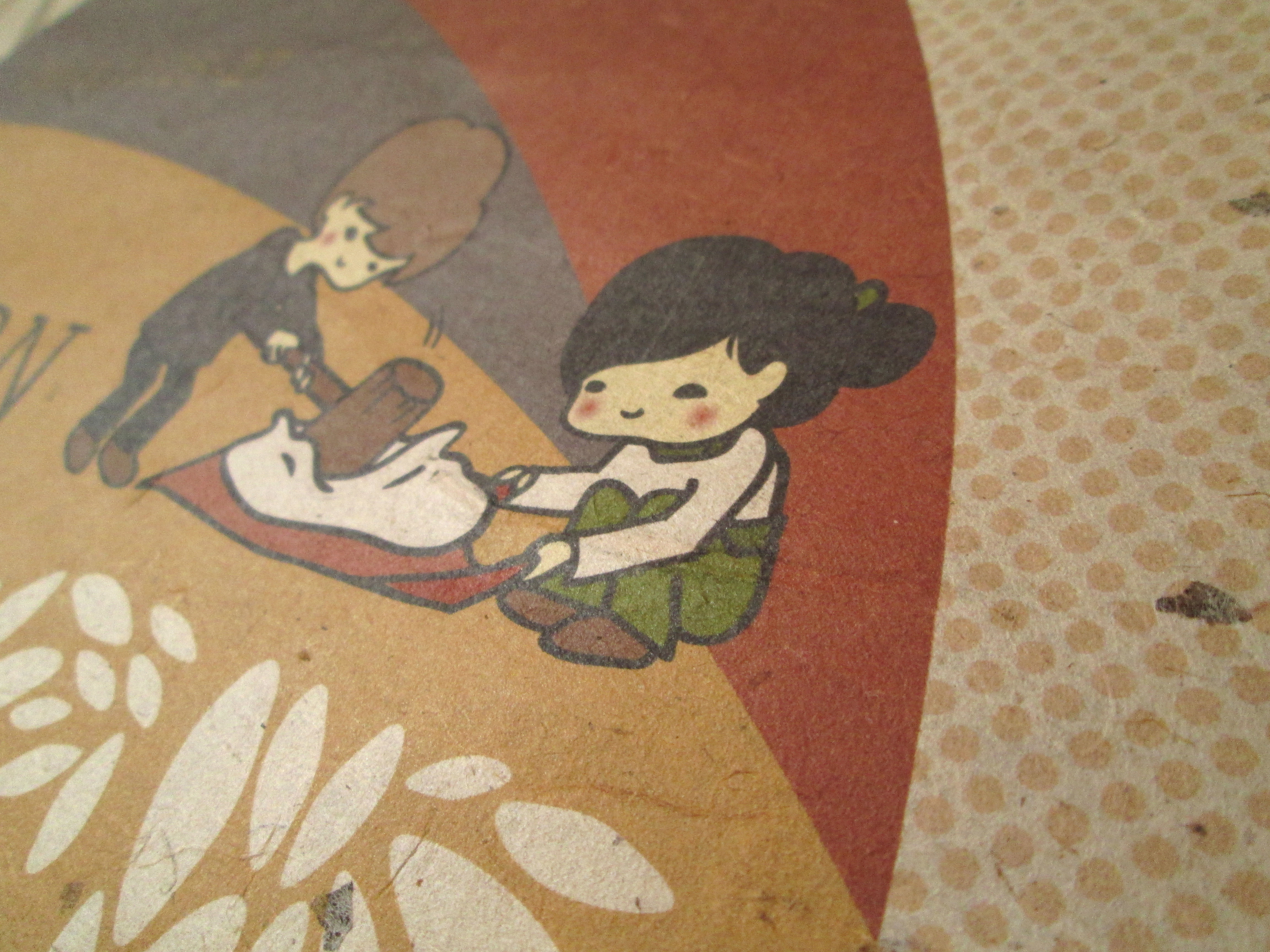
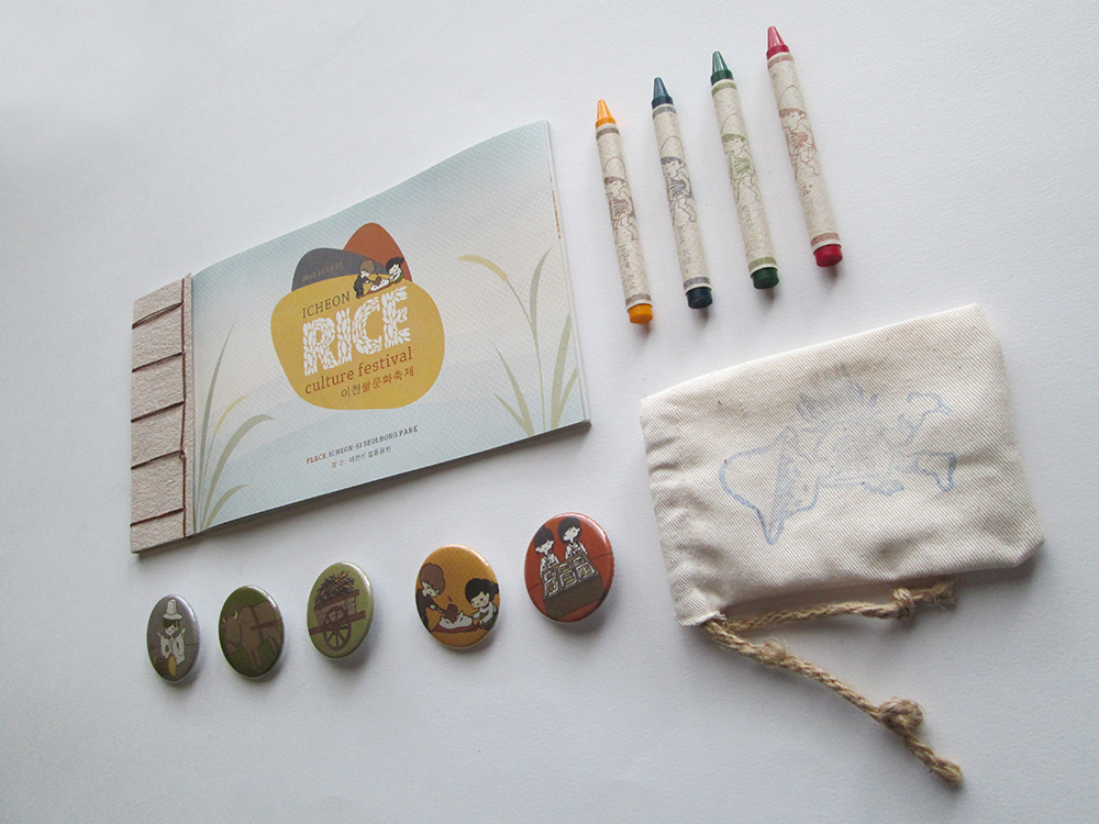
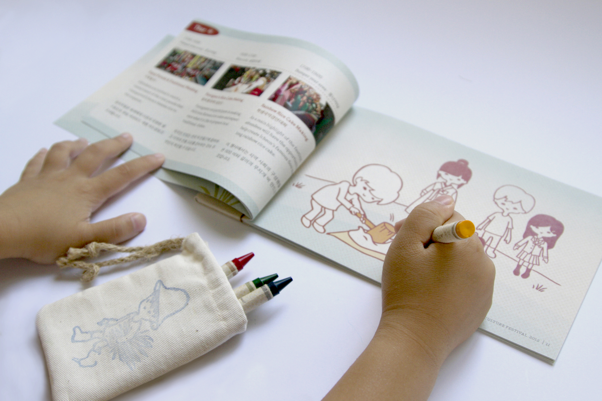
Icheon Rice Culture Festival Identity
This design initiative involves the rebranding of the Icheon Rice Culture Festival, an event held in South Korea every October celebrating the Icheon rice harvest and historical agricultural practices. The goal of the redesign is to distinguish this event as something that both local families and tourists with young children would enjoy. The project consists of a poster printed on Korean hanji paper, a festival events booklet doubling as a colouring book, crayons and buttons.
Adobe Design Achievement Awards 2013 Semifinalist
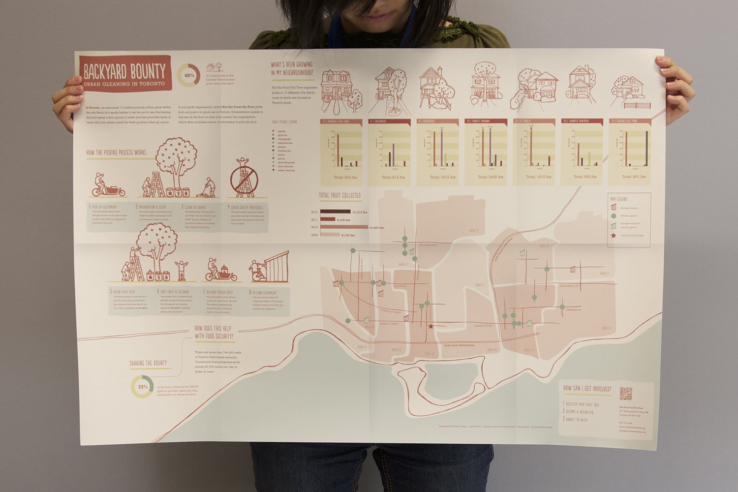

Backyard Bounty
The purpose of this poster is to provide an overview of urban fruit picking in Toronto, how it occurs and where the fruit is collected and distributed in each of Toronto’s wards. Using statistics gathered from Not Far From The Tree, it demonstrates just how much fruit grows in Toronto’s neighbourhoods and where a portion of the bounty gets distributed in order to help those in need.
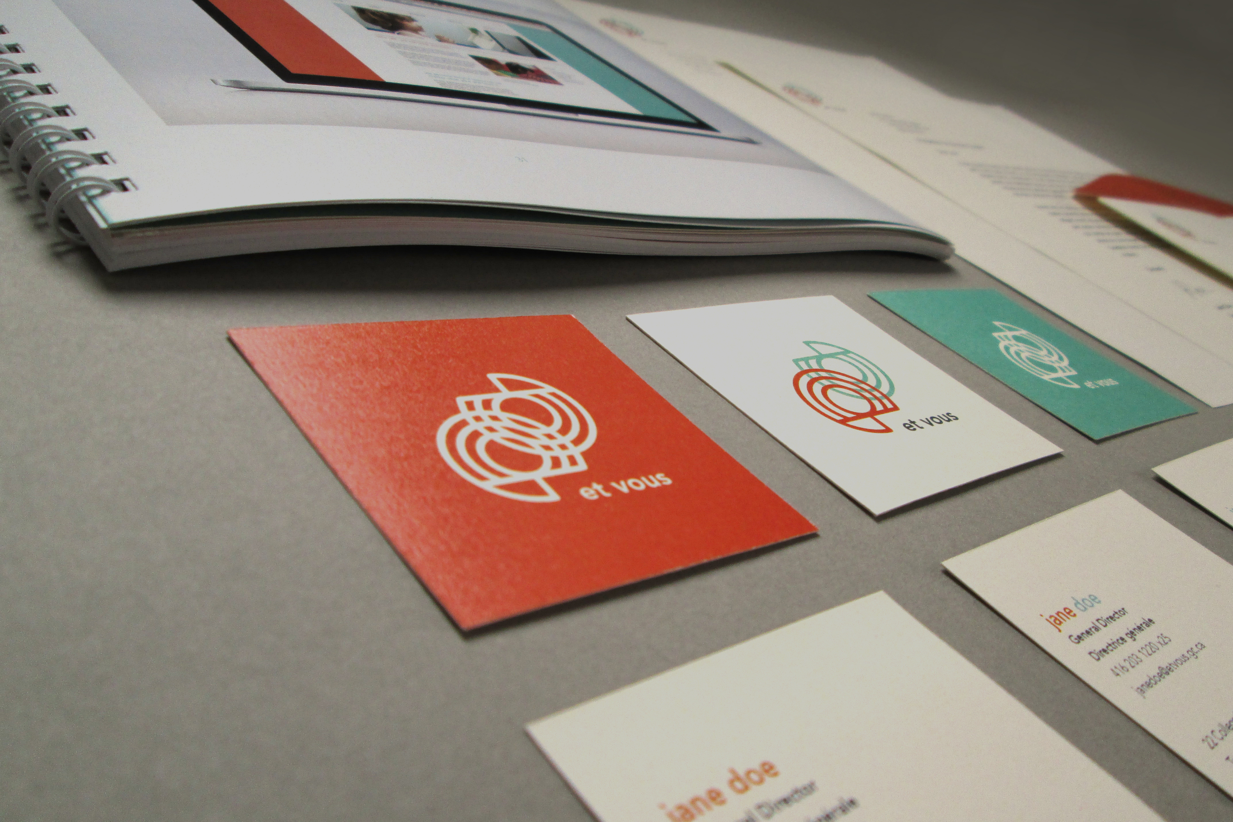
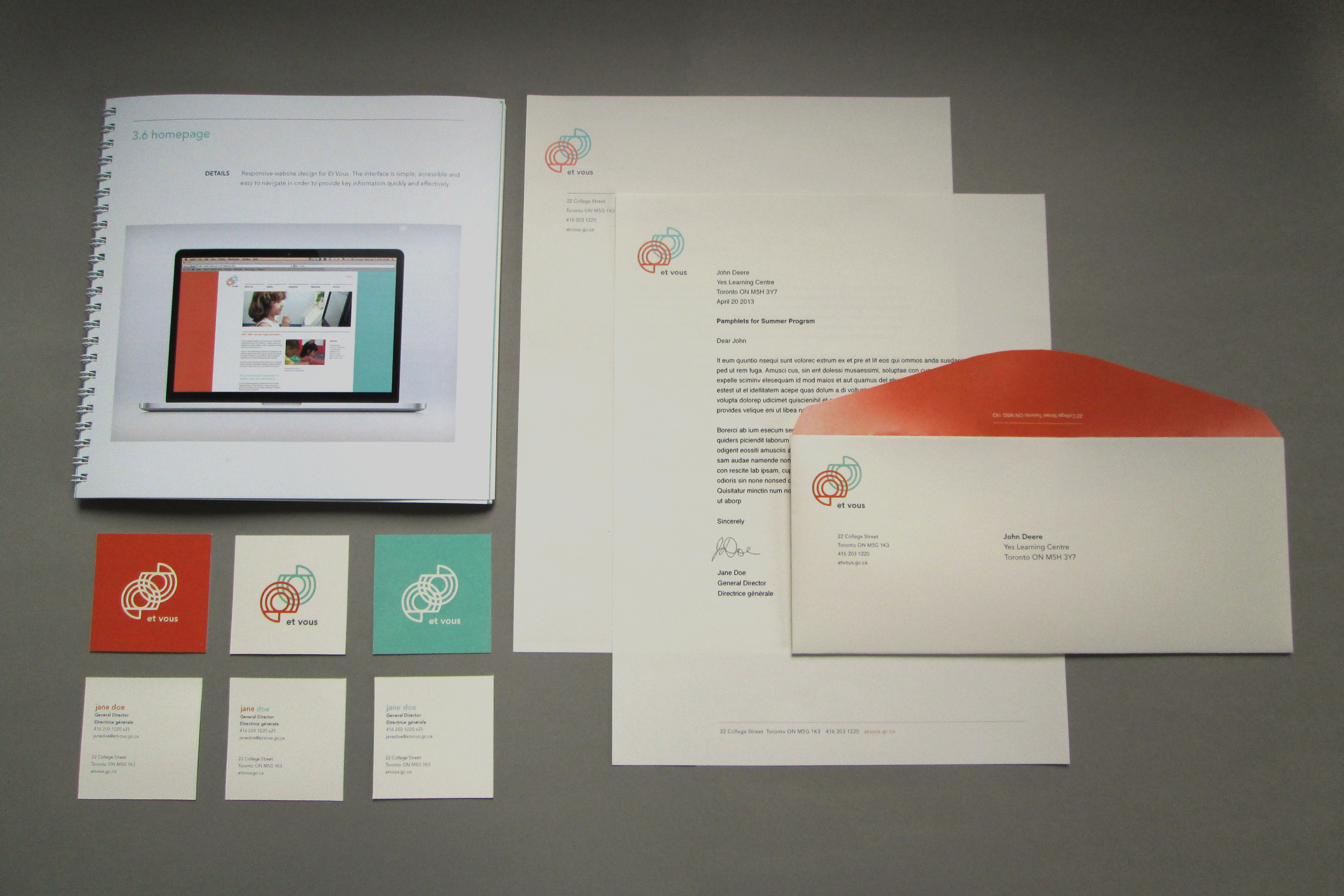
Et vous identity
This unified identity system involves the branding of Et Vous, an organization whose purpose is to promote and encourage French proficiency and literacy in Canadian children. Included in this initiative is the development of the mark, style guide, and both print and digital collateral materials. Exploring the concept of dialogue and exchange, the mark consists of two overlapping stylized e’s that also resemble sound waves. The use of orange, teal and a mix of the two throughout the brand application represents the organization’s aim to integrate the two languages and cultures and create a space for dialogue between the two.
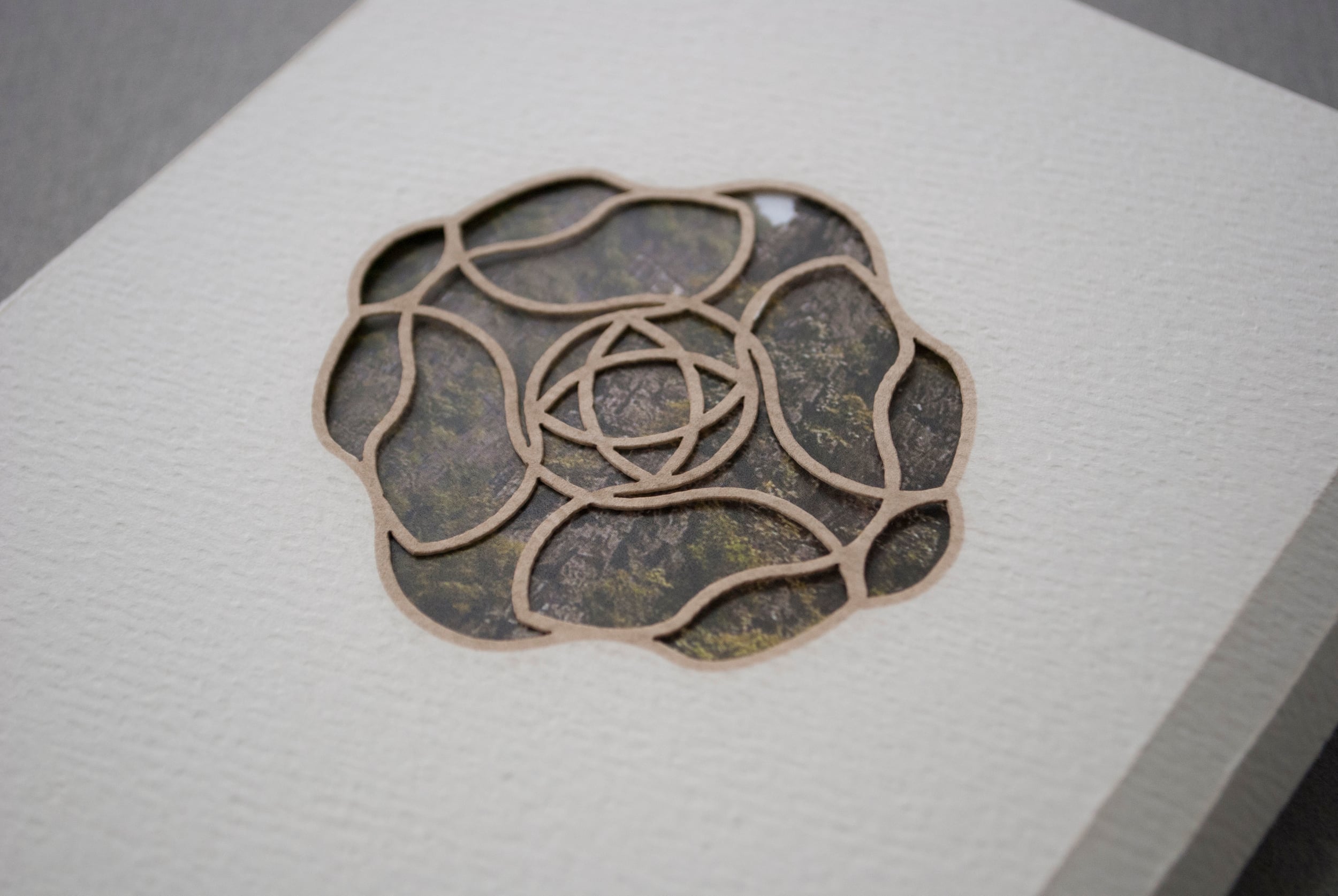
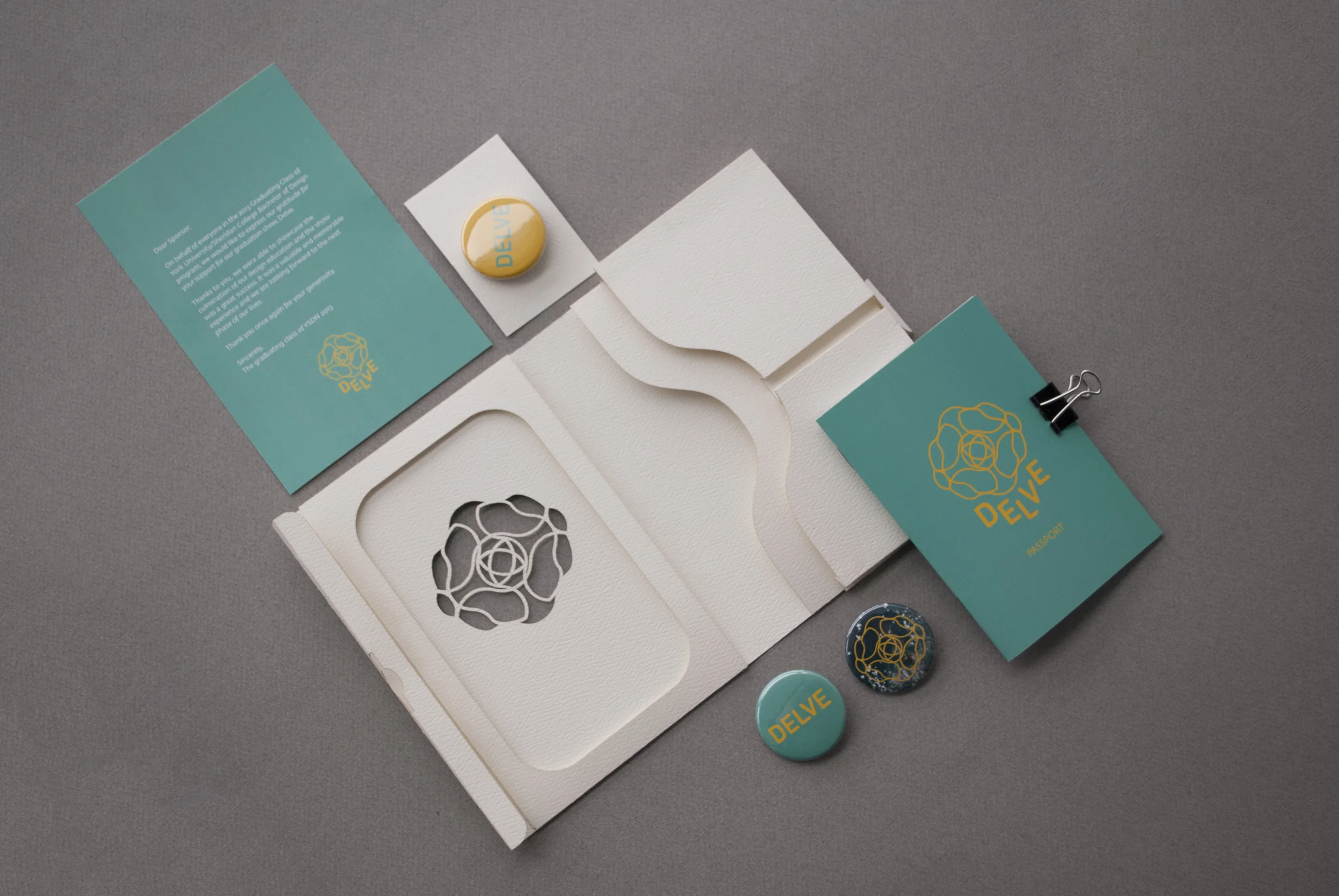
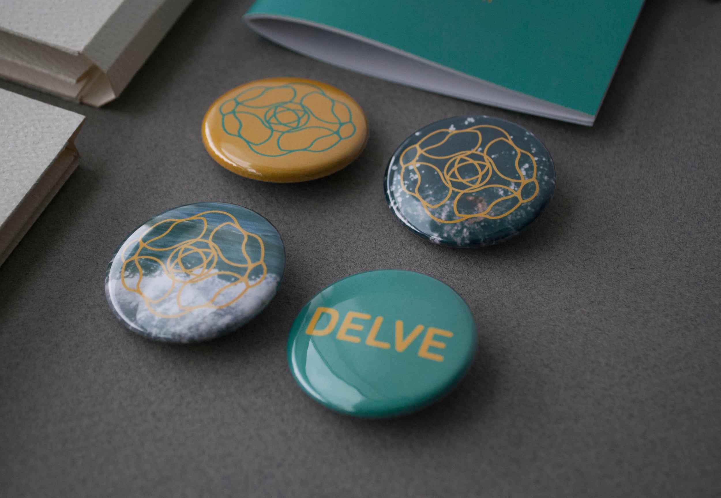
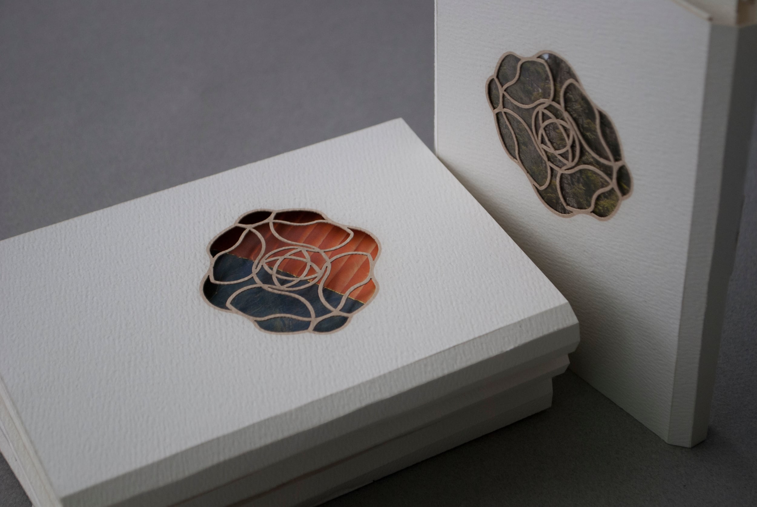
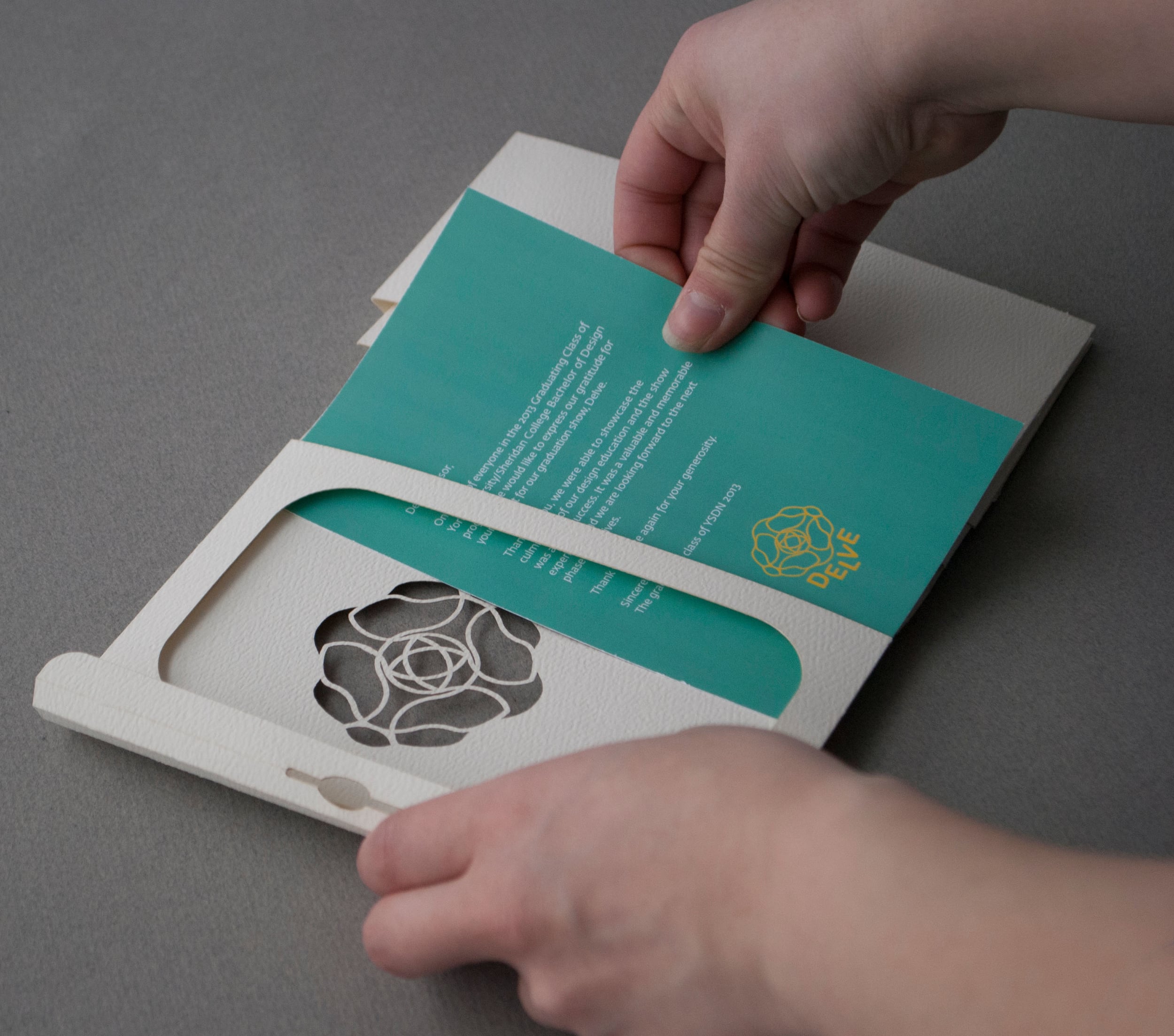
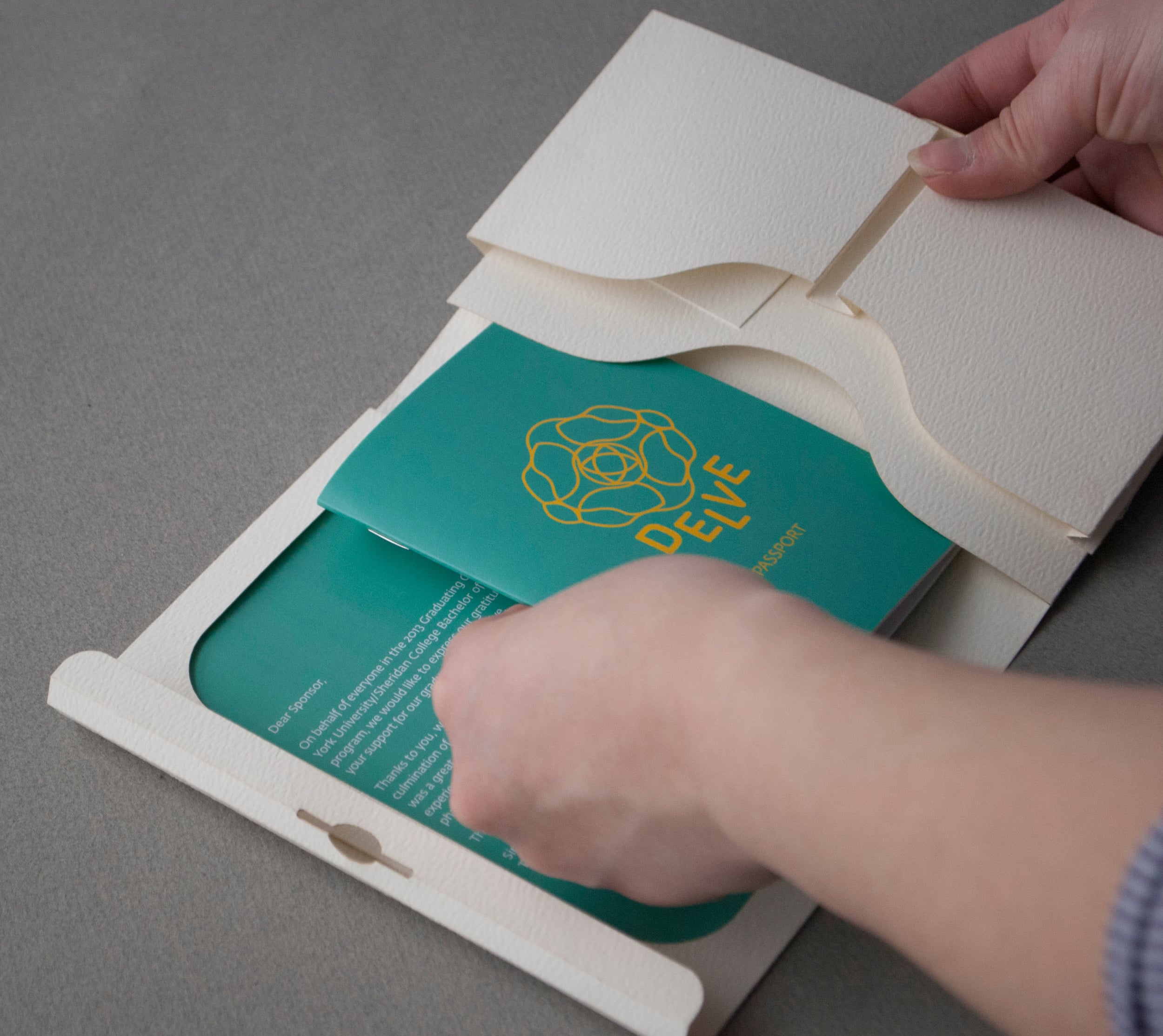

Delve 2013 Post-show Package
This collaborative done project with Richelle Rogers and Jiani Lu is meant to thank our sponsors for contributing to the York/Sheridan Design graduation show, Delve. The idea with the sponsor thank you package was to have recipients reflect back on the event, and to transform the package into an engaging experience that would inspire the user to explore our work and be inspired to go on their own adventure.
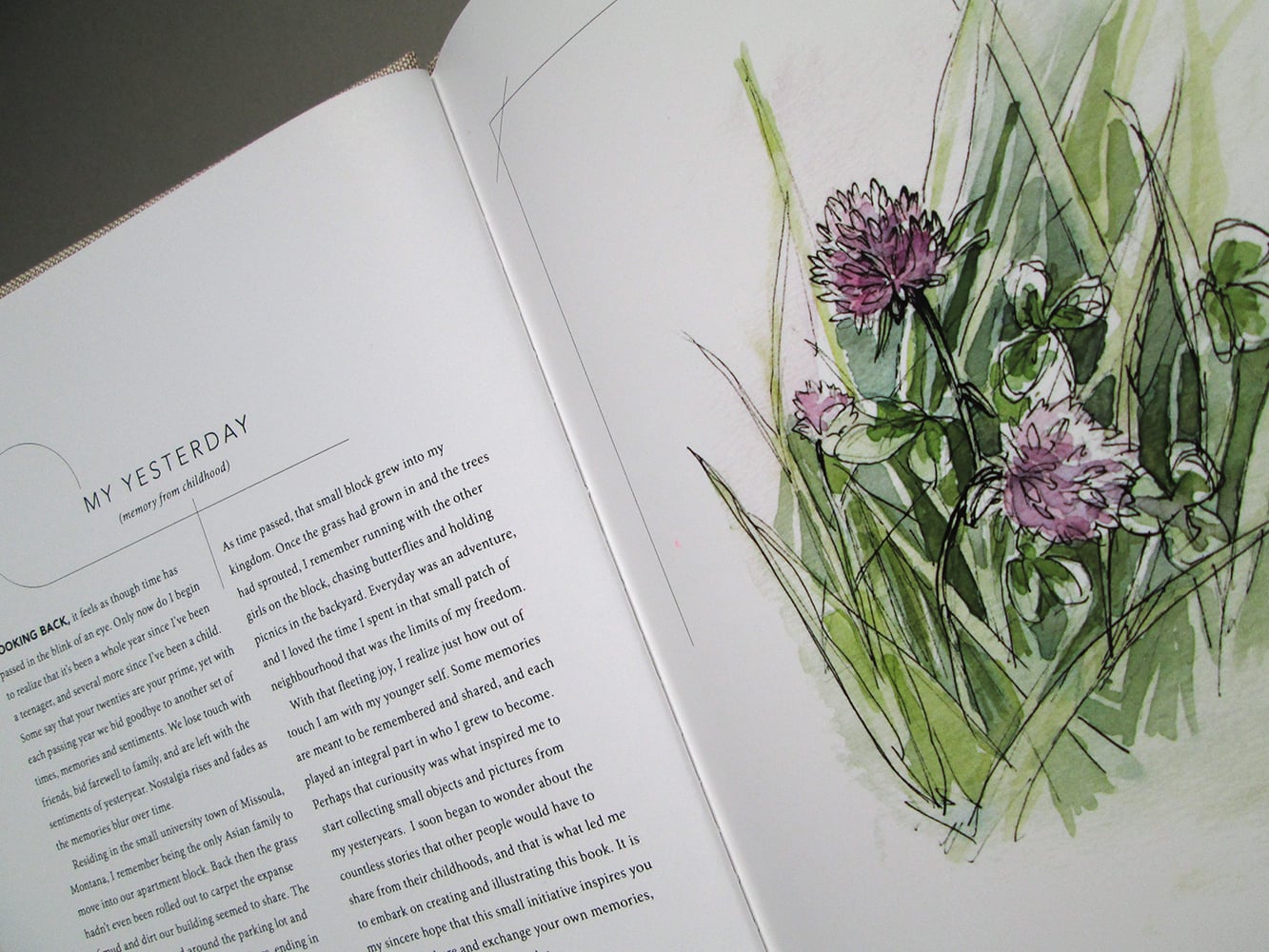
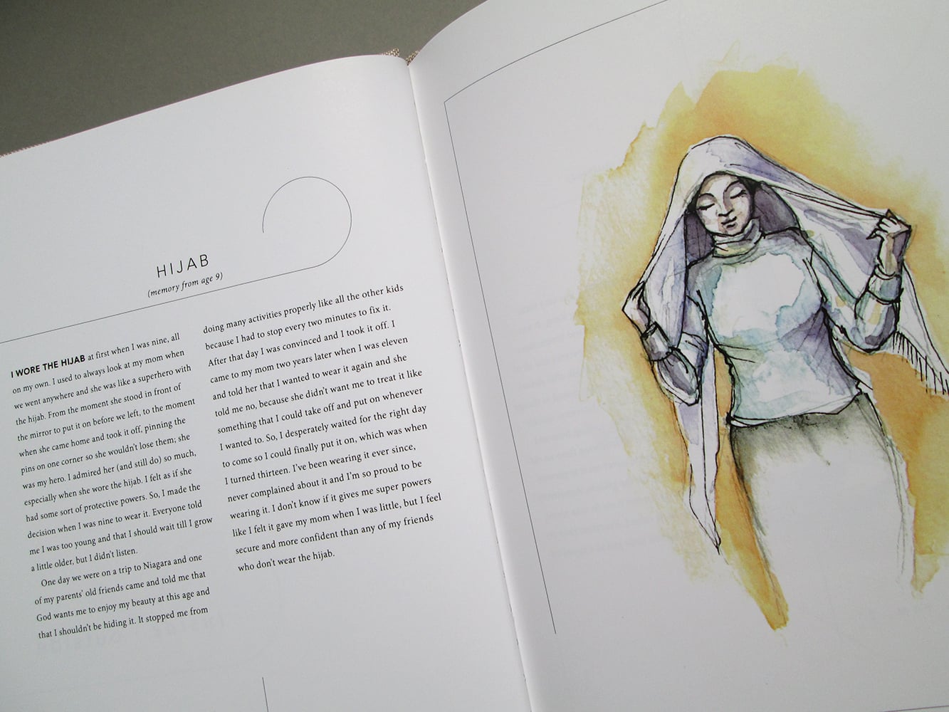

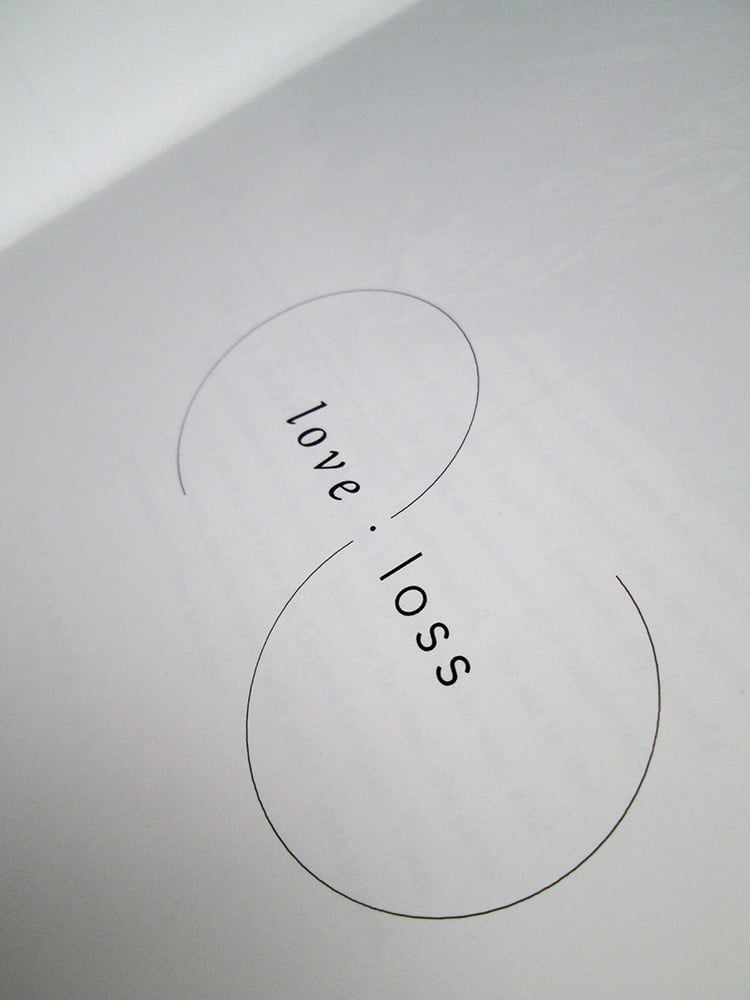


Yesterday
The purpose of this book is to provides a snapshot of what people value from childhood, and how the objects and experiences they cherish influence identity and how people think about the world. This anthology consists of a series of self-written and collected anecdotes from family and friends, arranged thematically and accompanied by self-generated watercolour illustrations. The custom typography etched into the jacket as well as delicate, monochromatic curled elements used throughout the book incorporate spirals and the infinity symbol to reflect the passage of time, memories and self-reflection. To emphasize the tactility of the imagery and the concept of crafting one’s own “yesterday,” blank watercolour paper was used to create the book jacket.
Adobe Design Achievement Awards 2013 Semifinalist